Analysis and reporting
Introduction to the analysis tools in Odoo
Odoo offers a full set of analysis and reporting tools, which turn your data into information you can act on.
Overview
The analysis features in Odoo fall into several categories:
- customisable dashboards;
- predefined standard reports;
- ad-hoc analysis tools: pivot views, charts;
- custom reports;
- built-in business intelligence.
Note
These analysis tools are available in every Odoo module, with native integration giving a view that cuts across your whole business.
Dashboards
Built-in dashboards
Odoo offers predefined dashboards for each module:
- the Sales dashboard, for following the pipeline and sales performance;
- the Purchase dashboard, for analysing spending and vendor performance;
- the Accounting dashboard, for seeing the financial health;
- the Inventory dashboard, for watching stock levels;
- the Manufacturing dashboard, for analysing production efficiency;
- the CRM dashboard, for following opportunities and conversions.
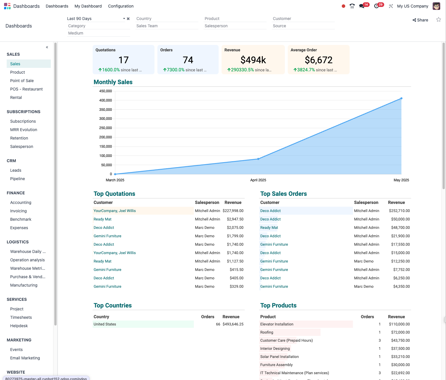
Building custom dashboards
To build your own dashboard:
- Open Dashboards › Configuration › Dashboards.
- Click Create.
- Give your dashboard a name.
- Add widgets: - charts: bars, lines, pie; - key performance indicators; - filtered lists; - pivot views.
- Arrange the widgets as you prefer.
- Define the filters and the contextual actions.
Tip
Build dashboards by role: an executive dashboard for the management, an operational dashboard for the managers, and specialised dashboards for each department.
The types of analytical view
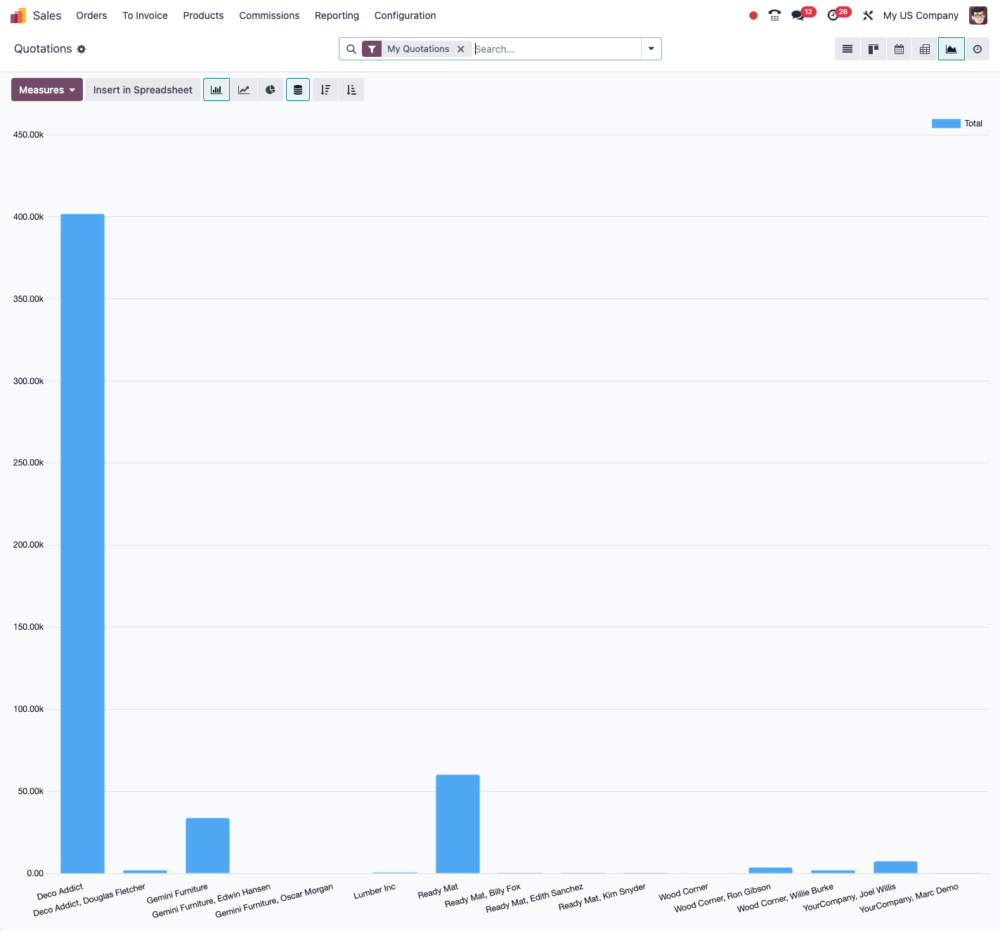
Graph view
The graph view lets you see your data as:
- bar charts, horizontal or vertical;
- line charts, with or without a trend line;
- pie and doughnut charts;
- stacked areas;
- scatter plots.
To use it:
- Open the list view of any data.
- Click the graph icon at the top right.
- Select the type of chart.
- Choose the dimensions: x, y, grouping.
- Apply the filters you want.
- Save the view for later use.
Pivot view
The pivot view is a powerful tool for multi-dimensional analysis:
- Open the list view of the data to analyse.
- Click the pivot icon at the top right.
- Configure the dimensions: - rows: product categories, customers and so on; - columns: periods, salespeople and so on; - measures: amount, quantity, margin and so on.
- Expand or collapse the hierarchy levels.
- Sort and filter to suit your needs.
- Export the results to Excel for deeper analysis.
Note
The pivot view is particularly useful for analysing trends, comparing performance and spotting anomalies in large sets of data.
Cohort view
The cohort view, available in Odoo Enterprise, analyses customer retention and behaviour over time:
- Open the customer or subscription data.
- Select the cohort view.
- Define the period of analysis: month, quarter, year.
- Watch how the cohorts develop over time.
- Identify the retention or churn trends.
Tip
Use the cohort view to analyse the effectiveness of your loyalty programmes, the lifetime of subscriptions or the effect of new features on retention.
Standard reports
Financial reports
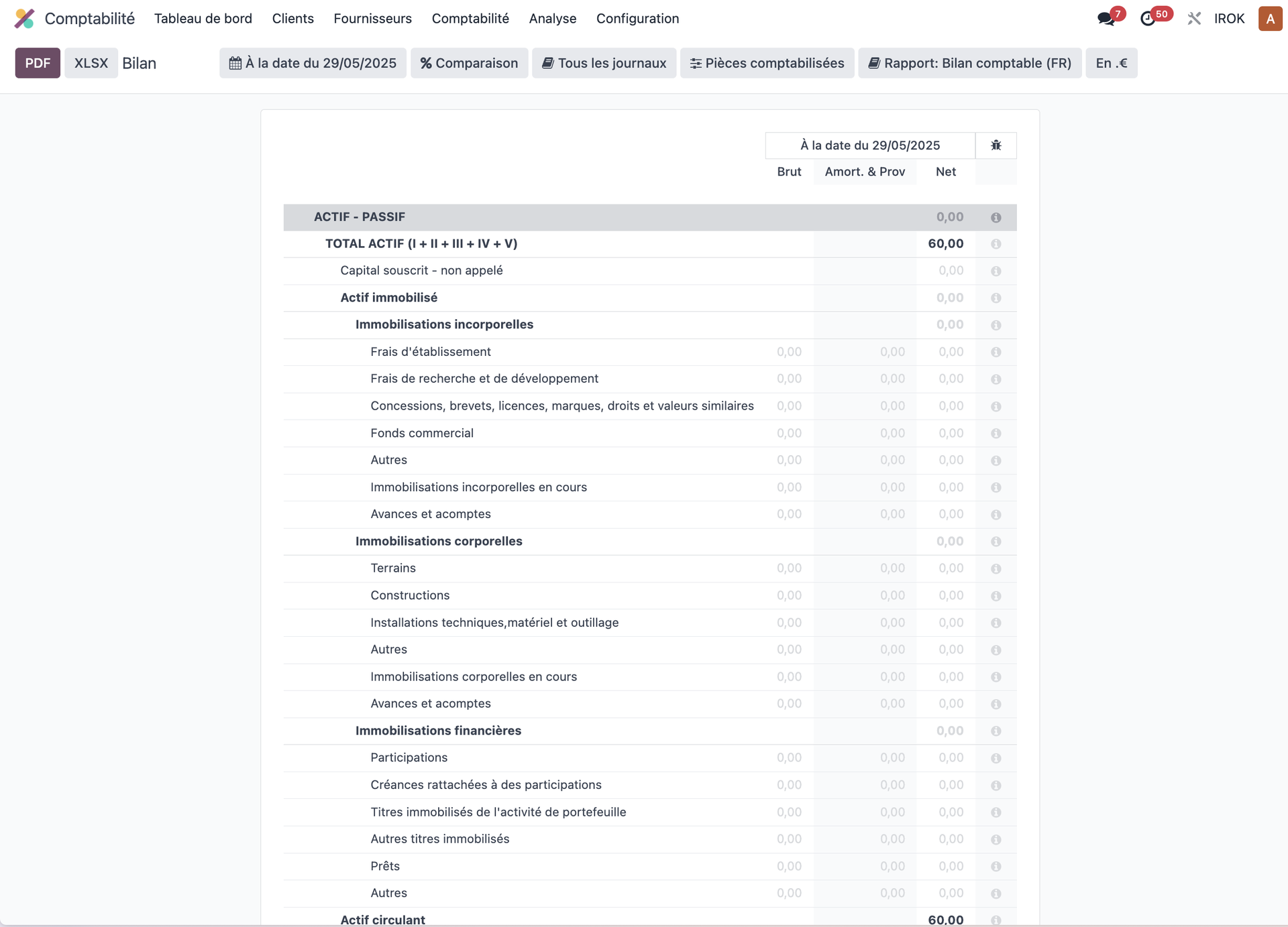
Odoo offers a complete range of financial reports:
- balance sheet;
- profit and loss;
- trial balance;
- general ledger;
- aged receivable and aged payable;
- tax reports (VAT);
- cash analysis.
Sales reports
To analyse your sales activity:
- sales analysis by product, category or customer;
- sales performance by salesperson or team;
- analysis of the sales pipeline;
- sales forecasts;
- margin and profitability reports.
Inventory reports
To run your stock effectively:
- stock valuation;
- stock moves;
- supply forecasts;
- stock age;
- ABC analysis, that is the classification of the products;
- stock turnover.
Production reports
To analyse your manufacturing processes:
- production costs;
- overall equipment effectiveness;
- capacity analysis;
- quality performance;
- scrap rate.
Building custom reports
QWeb reports
To build highly customised reports, for advanced users:
- Open Settings › Technical › Reporting › Reports.
- Create a new report template.
- Use the QWeb language to define the structure.
- Add Python expressions for the business logic.
- Customise the layout and the styling.
- Attach the report to the data models concerned.
Note
Building QWeb reports calls for technical knowledge of XML, HTML and Python. Less technical users are better served by custom views or by the export tools.
Custom views
To build custom analyses with no programming:
- Open the list view of the data to analyse.
- Apply the filters you want.
- Choose the appropriate view: list, graph, pivot.
- Click Favorites then Save current search.
- Give your custom view a name.
- Decide whether it is to be shared with other users.
- Add it to your dashboard where useful.
Exports and integration
Exporting data
To analyse your data in outside tools:
- Open the list view of the data to export.
- Click Action then Export.
- Select the fields to export.
- Choose the format: CSV or Excel.
- Click Export.
- Open the file in your preferred analysis tool.
Tip
Save your export formats so you can reuse them easily for your periodic analyses.
Business intelligence integration
For advanced analysis with business intelligence tools:
- Connect your BI tool (Power BI, Tableau, Qlik) to Odoo's PostgreSQL database.
- Build data models in your BI tool.
- Build advanced dashboards.
- Configure automatic refreshes.
Note
Direct integration with BI tools generally calls for a system administrator to configure database access following good security practice.
Alerts and automation
Condition-based alerts
To be told proactively about situations that matter:
- Open Settings › Technical › Automation › Automation Rules.
- Create a new automated action.
- Define the trigger conditions.
- Configure the action: email, internal notification and so on.
- Enable the alert.
Tip
Set alerts for the critical situations: stock below the minimum threshold, high-value opportunities with no recent activity, customers approaching their credit limit.
Scheduled reports
To receive regular reports automatically:
- Build and save your custom report.
- Open Settings › Technical › Automation › Scheduled Actions.
- Create a new scheduled action.
- Configure the periodicity: daily, weekly, monthly.
- Define the action that produces and sends the report.
- State the recipients.
Good practice in analysis
Structuring the data
For effective analysis:
- make sure your data is correctly categorised;
- use labels and tags consistently;
- keep the data clean and up to date;
- define a clear hierarchy for the analytic items.
Designing dashboards
For effective dashboards:
- keep to the indicators that genuinely matter;
- organise the information logically, from the general to the particular;
- use visualisations suited to the type of data;
- include comparisons: previous period, targets;
- allow drill-down, so the detail can be explored.
Tip
Follow the "3-5-9" rule: a dashboard should hold no more than 3 critical indicators, 5 important performance indicators and 9 detail metrics.
Reading the reports
To get the most out of your analyses:
- look for trends rather than absolute values;
- identify the correlations between different measures;
- analyse the gaps against forecasts or targets;
- dig into the detail to understand the causes;
- use the analyses to form hypotheses you can then test.
Advanced features (Odoo Enterprise)
Odoo Studio
With Odoo Studio, available in the Enterprise edition:
- create computed fields for your analyses;
- customise the views with no technical knowledge;
- add custom filters and groupings;
- build tailored reports through a visual interface.
Odoo Spreadsheet
With Odoo Spreadsheet, available in the Enterprise edition:
- create spreadsheets directly inside Odoo;
- pull in real-time data from your system;
- share the analyses and work on them together;
- embed the sheets in your dashboards.
Note
Odoo Spreadsheet combines the flexibility of a spreadsheet with the live data of your system, which gives the best of both worlds for your analyses.